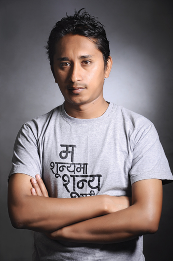
Ananda K. Maharjan is probably the only Nepali professional type design artist creating Devanagari fonts for day-to-day use. How is that culturally relevant? Read on to know more.
For those who don’t understand a particular script and the typography of a certain language, there is a saying in Hindi - “Letters are like black buffalos”. Meaning? They are just scribbles, they don’t make any sense. Enter Ananda K. Maharjan, a type design artist (or simply put, a font-maker) for whom words, letters or fonts are unlike those infamous buffalos. For Maharjan, every nook, every loop, every slant, every edge, and every twirl in a particular font matters, even to the slightest degree.
Maharjan started doodling and scribbling some ten years ago when he was working at Format Graphic Studio, a job that basically involved designing booklets for NGOs and INGOs. “We mostly had to take things provided to us in English and convert them into Nepali. It always bugged me to see so many font options for the English language but so few for Nepali,” he says. According to him, a designer’s eyes want to see a similarity in layout which couldn’t happen then because the necessary fonts weren’t available. So, he started playing around with Hindi fonts, which had a wider range than the ones in Nepali. However, since they were made particularly for Hindi, it wasn’t easy to make them work.
 A decade or so has passed since then and Maharjan has already released more than 20 different fonts, with more than double that number on his work station. “Easy as it may look, making fonts isn’t everyone’s cup of tea. Even I haven’t perfected this art,” he admits.
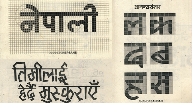
Font-making is an intricate process. The first step is “doodling” them on paper followed by getting the glyphs done on a computer. Then comes coding the vector designs into the individual keys of a keyboard. For doodling, Maharjan uses a notebook with checkbox grids for the first prints of the design. “It’s like coding. Paint some boxes black, and leave some of them white. This makes things easy when I work on the actual doodle on a computer.” Maharjan uses Adobe Illustrator to get the glyphs in a vector format. Each individual font is saved as a vector smart object. Finally, these illustrations are exported into Fontlab Studio and assigned to their corresponding keys.
Maharjan is currently working on a keyboard arrangement style called Traditional Layout which uses around 150 standalone characters. “Using the Traditional Layout universally is not easy and not acceptable either. This is a Unicode Layout era, but I haven’t being able to jump into that at present because, compared to 150 individual characters of the Traditional Layout, Unicode demands over 1500 characters. It’s like making ten different fonts at once!”
Ananda 1HV&MD was the first font that Maharjan created and says that he replicated the style used in English to get his early work done. He then kept producing more. “Font-making has given me recognition. I still don’t know how to raise funds for the labor I put into it but getting opportunities to work in the promotion designs of Nepali films is an achievement in itself,” he says with pride. A poster for Nigam Shrestha’s “Chhadke” was his initial foray into the field. Since then, he has worked on more than 20 film posters, each with a unique font design, and has 20 more projects on the table.
BauchaOMaicha, a webcomic that promotes Newari culture, is another project that Maharjan is busy with. The font for BauchaOMaicha and an illustrated Newari language teaching aid are on his agenda to help the language reach a wider audience. So, what’s the cultural impact of using a particular font? Maharjan has a clear cut answer—”Individuality in branding.”
In foreign countries, font-making requires a big budget and designers charge handsomely, but the case in Nepal is different. “Making fonts is cheaper here because we aren’t into Unicode Layout yet,” explains Maharjan.
The type design artist also has a bone to pick with homegrown companies. “Nepali brands have no sense of individuality whatsoever,” he says. “International corporations like Coca-Cola, Apple, Nokia, etc are very strict or probably even rigid about their guidelines but the situation is worlds apart here.” Maharjan believes that even companies like Ncell, who spend a huge amount on advertising each year, are not conscious about their fonts. “Ncell uses a font named Aakriti which is very common. This shows the indifference of Nepali brands. If people could be more conscious about their designs, the brand could receive a solid identity”
But until a Nepali company elevates into “a perfectly aligned brand,” letters and alphabets are still like black buffalos. Perhaps with the help of people like Ananda K. Maharjan, they could strive to rise above that.